Get Up to Google Speed with Mobile First Indexing
I have two important Google related items that will impact how your site appears to users using the Google Chrome browser and how your website ranks with the search giant.

Background: Mobile-first indexing means that Googlebot will now use the mobile version of your site for indexing and ranking, to better help our (primarily mobile) users find what they’re looking for. Google’s crawling, indexing, and ranking systems have historically used the desktop version of your site’s content, which can cause issues for mobile searchers when the desktop version differs from the mobile version. Our analysis indicates that the mobile and desktop versions of your site are comparable.
The biggest change in SEO, whether Google, Yahoo, Bing or Yandex has been the mobile revolution. Google announced its mobile-first index in November 2016 because they were trying to solve a problem. Most people were using Google on their mobile devices, but Google’s ranking systems were based around the desktop.
The solution — mobile-first indexing — changing our world. Developers, designers and SEO experts are putting mobile first. What this mean for you is you might have to make some serious changes to your site if you want to even have a shot at ranking well.

The first thing to consider is that there is no need to freak out. So far this change is only in its earliest stages of testing, and is being rolled out very gradually only to websites which Google considers to be “ready” enough for this change to have a minimal impact.
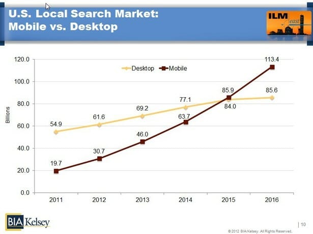
According to Google’s own latest guidance on the topic, if your website is responsive or otherwise identical in its desktop and mobile versions, you may not have to do anything differently (assuming you’re happy with your current rankings!). Three out of every five searches happen on mobile, and mobile far outpaces desktop as the number one method of searching.
A mobile website needs a different design than a desktop version to appeal to your audience. Your screen is tiny. Google explained last week that hamburger or accordion menus are perfectly fine to use. These kinds of menus make sense; they help a mobile user to browse through your website. Putting content behind a tab to make the mobile experience better is also totally fine.
What if I don’t have a mobile version of my site?
If you don’t have a mobile version of your site and your desktop version is not mobile-friendly, your content can still be indexed; however you may not rank as well in comparison to mobile-friendly websites. This may even negatively impact your overall rankings on desktop search as well as mobile search results because it will be perceived as having a poorer user experience than other sites (since the crawler will be a “mobile” crawler). More importantly, consider your audience. Given that over two thirds are using mobile devices today you may want to impress rather than annoy.
How does this change ranking factors and strategy going forward?
This may impact a variety of ranking factors and strategy in the future; Cindy Krum at Mobile Moxie has written two excellent articles on what could be coming in the future around this topic.
Cindy talks about the idea that mobile-first indexing may be “an indication that Google is becoming less dependent on traditional links and HTML URLS for ranking.” It seems that Google is moving away from needing to rely so much on a “URL” system of organizing content, in favor of a more API type approach based on “entities” (thanks, structured data!) rather than URL style links. Check out Cindy’s posts for more explanation of how this could impact the future of search and SEO.
Is there a difference between how responsive sites and separate mobile sites will be treated?
Yes and no. The main difference will be in terms of how much work you have to do to get ready for this change.
If you have a fully responsive site, you should already have everything present on your mobile version that is currently part of the desktop version, and your main challenge will simply be to ensure that the mobile experience is well optimized from a user perspective (e.g. page speed, load time, navigation, etc).
